Calculator Dial Comparison
Not to sound like an old man, but I agree with people who think that analog readouts are often better than digital. I'm not saying that digital is bad—it's much more precise and it's great in a lot of applications. But analog dials offer a lot of things that digital displays lack: You can see the relationships between the numbers, the progressions of the numbers on the spread, and how far things are from each other. You see the difference between ƒ/8 and ƒ/16; you see the difference that three stops makes. You can see how the numbers shift as you change film speeds. That's infinitely harder to do with a digital display.
But calculator dials definitely have their drawbacks; they're typically complicated and intimidating to the beginners who would benefit most from them. Paradoxically, the more information that is jammed on them, the more difficult they become to use; numerals get smaller and harder to read; ranges blur together; the face becomes crowded and unintuitive. Calculator dials are limited in their size because they have to fit the compact size of the meter case; that means hard choices have to be made.
Below I've presented a number of calculator dials from a variety of meters in my collection. I thought it would be interesting to look at the approaches that various manufacturers used and how things developed over time.
Gossens
|
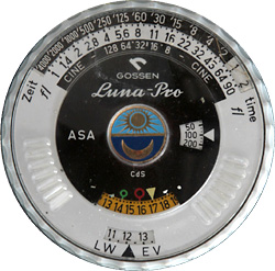
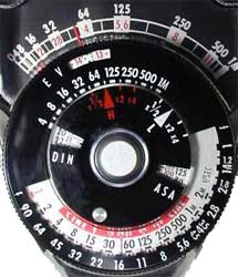
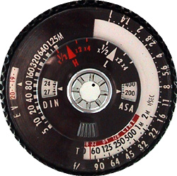
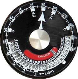
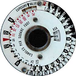
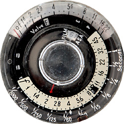
Luna-Pro (1967) This is a largish dial, and yet so much of it is blank. The result is terrible crowding along the top where you read the speed/stop combinations. The ƒ/stops are marked in thirds, but it's still hard to read. |
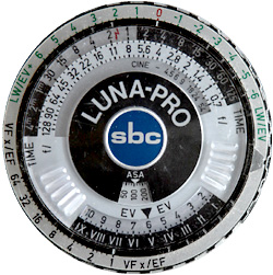
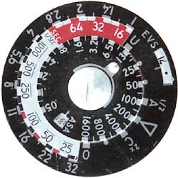
Luna-Pro sbc (1977) Revised to make better use of the dial space. It's still crowded and complicated, but it does a lot in return. Most notably, there's a plus and minus stop scale along the top outer ring for exposure compensation, and a Zone System ring on the bottom. If you spend the time to learn the dial, you can really go to town with this meter.
|
|
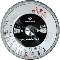
Pilot (1960) Simple, clean and easy to read in full-stops, but you can interpret half stops. I also like the dual-ASA readout so you can more precisely set your film speed. |
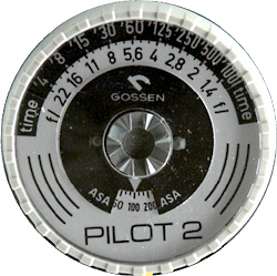
Pilot 2 (1975) I'm not really sure why they changed it, since to me it's not an improvement. They moved the scales to the top of the dial, but they got rid of the dual film-speed window. The only serious change is the inclusion of third-stop hash-marks.
|
Norwood Directors
|
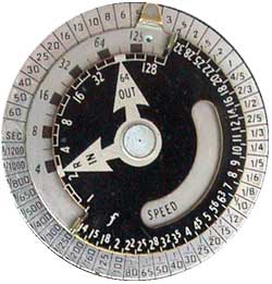
Model A (1946) Quite a dial, isn't it? Reminiscent of the early Westons. The outside ring is shutter speeds, the ƒ/stops are inside on the right (as you see here). The inside left was for cine work (as this is really what the meter was designed for). In and Out refer to the bright light slide, which was a special Norwood feature. |
Model B (1948)
The meter was fundamentally re-designed; you can still buy one new today and it looks mostly the same. The calculator is on the bottom: shutter speed in red (hard to see here) and ƒ/stops on the outside bottom. Full stops are white on black; intermediate thirds are black on white. |
Model C (1950) Fundamentally the same, except that Norwood added an ƒ/stop range at the top under the footcandle ring. If you used the proper slide to set the meter for a given film speed and shutter pair, you could direct-read the ƒ/stop. |
|
Brockway/Sekonic Type S (L-28) (1958) Sekonic purchased the rights to this meter, and they continue to make it today. This is their first stab at redesigning the dial: bare metal with (mostly) black markings. This picture isn't very good, but I find it hard to read regardless. |
Sekonic L-28C2 (1970) Sekonic's next major stab at it. Even though it's largely black and white (with splashes of red), it's still very clear and crisp to read. It's a huge improvement over the Type S. |
Sekonic L-398 (1978) Sekonic made more tweaks to the meter but left the dial largely alone. It's crisp and clean and easy to read. |
Westons
|
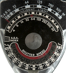
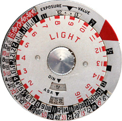
617 (1934) Weston's first photographic light meter had a surprisingly sophisticated dial. The footcandle scale is on the top, marked in half-stops; then you get a speed dial (black on white) in half-stops; then two aperture scales—one in full stops and the other in halves. They also introduced the contrast-range marks (ABC here, they would later become UAOC) with word explanations. This was quite a busy dial. Unfortunately, it's about the size of an Eisenhower dollar and not easy to read. |
Senior (1935) If this photo is hard to read—the original isn't any better. The numbers are very small and jammed together; Weston's attempt at giving combinations in 1/3rd stop increments for both speed and aperture. You need good eyes to read this one, particularly in poor light.
|
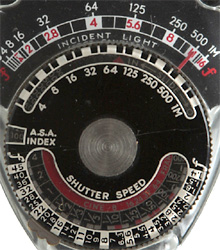
Master (1939) and Master II (1945) Weston cleaned up the dial a bit; the footcandle scale on the top is now in full stops only with hash-marks at the halves; but the speed/aperture readout at the bottom is still in thirds. They did add a band of red around the film speed setting, but I don't think that helps much. |
|
Master IV (1960) My favorite of the Master dials. This was a complete redesign (as was the meter). The numbers are a lot larger and you don't need bifocals to read them; they also recalibrated to full stops with hash-marks at the halves, which mimics the calibration on most camera dials and lenses. They also reversed positions: the footcandle range is now inside, and the ƒ/stops are outside, which gave them more room and allowed them to print the numerals larger.
|
Master V (1963) This is often referred to as the roulette wheel. Since they went back to third-stop increments, they tried to make it more readable by color-coding things. It's a good idea but it's still hard to read.
|
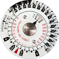
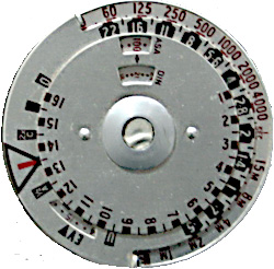
Ranger 9 (1966) This has the advantage of being larger than the Masters, since the meter itself was much bigger and heavier.
This is the last major redesign of the series. Instead of the roulette wheel, the speed (outer ring) is black on white (bare metal), the ƒ/stops are white on black, and the light values are red on white. There's also an EV ring between the light values and the stops (which would disappear in subsequent iterations). Everything is now in ½-stop increments instead of thirds, which makes it a little less cluttered and easy to read. Half-stops also conform to most modern film camera lens and speed settings. |
|
Master 6 (1972) This is a Japanese-made meter (previous Masters were American or English). The meter itself was a failure, but they tried. It's obvious that they copied the Ranger 9 dial.
|
Euro-Master (1974) [I'll try to get a better photo.] They rethought the outer-dial, which is now red on bare-metal, and ditched the EV ring, but the rest is mostly the same as the Ranger 9. It's also a little smaller, but still easier to read than the Master V.
|
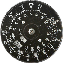
Sekonic L228 Zoom (1970) Tell me that's not a Weston dial. It's even got the UAOC marks. It's calibrated in half-stops for speeds and stops, but the EV numbers (inner dial) are in thirds. No color coding, but it's still easy to read. The real advantage is that the dial is physically a bit larger than the Masters, and they could make the numbers larger and less crowded.
|
Oddballs
|
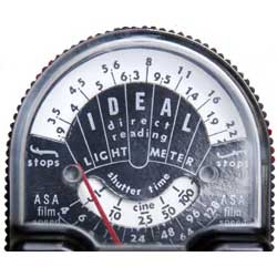
Federal Ideal (1953) There's a knob on the back, and as you turn it, the white card of the meter face rotates. So what you do is turn it until your shutter speed matches up with your film speed, and then you pointer shows you the aperture. Or you could pick your aperture and see which shutter speed to use. Great and unique, except that it tops out at ASA 128.
|
Norwood Super Director (1958) Believe it or not, this picture is much easier to read than the actual thing; smaller usually isn't better where calc dials are concerned. Plus it incorporate a very clever, albiet complicated, method of direct-reading the aperture that was just more work than it's worth. |
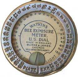
Watkins Bee (1907) This is nearly all dial. The little wedge at the 6 o'clock position was a piece of printing-out-paper. Looks simple but using it was actually quite a chore. Check out my web page to see how to use it, or the pdf manual for the step-by-step.
|