
.jpg)
I have a soft spot in my head for Royal typewriters, particularly the pre-WW2 models. Right around World War II they started getting drab. Gloss black changed to matte, then to gray. These full-size typewriters were office machines and the Mr. Harts of the world (Mr. Hart was the boss in the movie 9 to 5) probably though the blah look was more serious and professional. I don't see the problem with giving the back office a little bit of charisma, though.
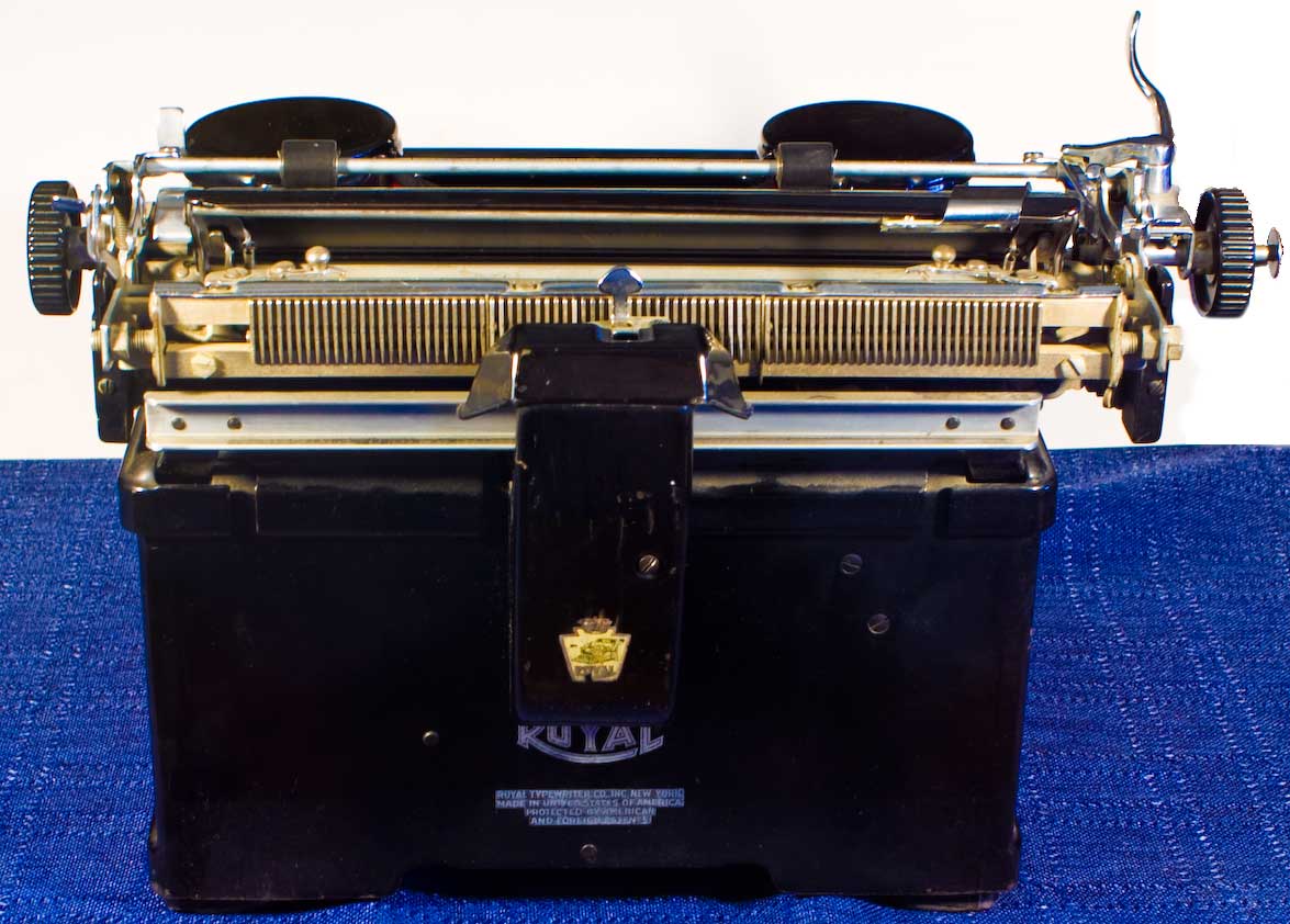
Later the top-level ribbon holders moved under the cap, which gave the top a cleaner line and allowed the top to open so you could also get in and clean the keybed, but I still find these more attractive. Likewise, the beveled clear-glass panels from the Model 10 carried over but were replaced, and I haven't been able to determine when, with beveled black glass, then replaced again with plain metal panels. These panels would remain a design feature on a lot of subsquent Royals; I haven't yet determined when they disappeared. I understand the idea of replacing the glass with cheaper sheet metal, though again I think it was a step backward. But why they left the panels on at all is a mystery to me. 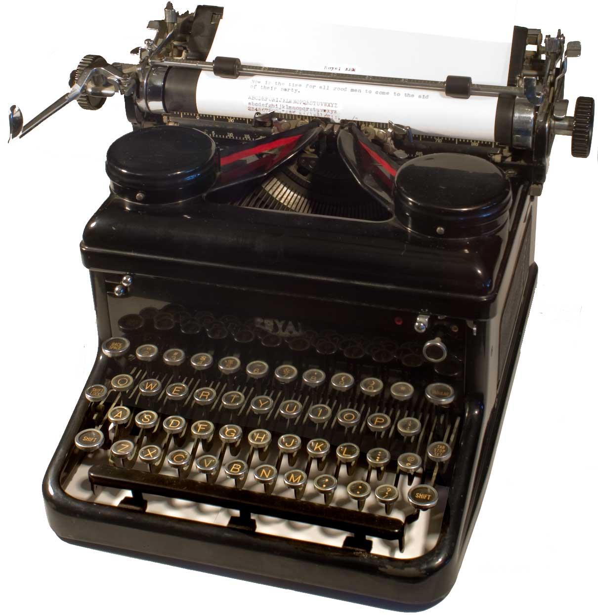
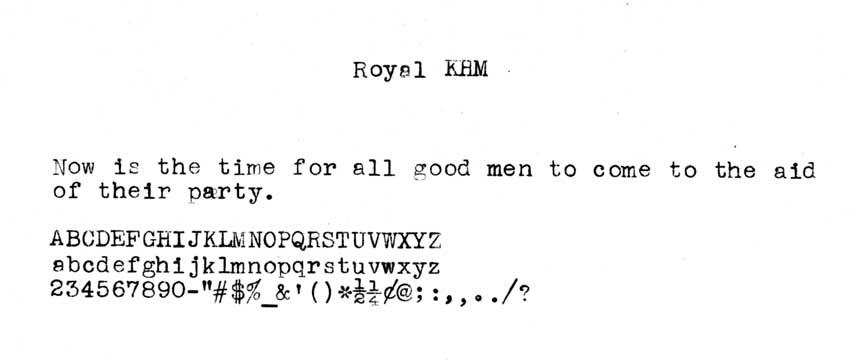
This is my KHM, made in 1938 according to the Typewriter Database. It is, I believe, the best looking typewriter ever made. Other people are going to go with post-war models, usually luggables in bright colors, but I'm going with this. If they'd put the ribbon covers on the Model 10, I might have ceded the title to the 10.
The only thing that irks me about this machine is the lack of the beveled glass-sides. I have a pair of black beveled-glass (they painted the inside of each pane black) and I'm going to swap it out and see if they fit. I don't recall, but one might even have the touch-control pointer scale on it. As I said earlier, I don't know why they changed except that it would be less expensive to use stamped metal panels, but what price beauty? And as I also said above, why does a piece of back office equipment have to look like a Victorian undertaker?
 After the Model 10, Royal did some strange things with the model designations. In advertising they tended just call this their standard typewriter, as opposed to their portable, and didn't bother to give it a name. Those would come later. From what I can gather from The Reverend Monk's website, "H" is the base model and "K" means keyset. I'm going to assume (unimpeded by actual evidence) that K means the English keyset, and they may have had other prefixes for other keysets like French, Spanish, German, etc. I may be wrong.
There were various H models and I'm still trying to figure them out, so this really an "HM" base model. So KHM. Royal added another prefix, DT, for the version that had 5 extra keys with decimal 0s for accounting and financial use; that model was a KDTHM (I almost got one but missed the auction by a few minutes. Oh well.)
Just after this they introduced the "magic margin" feature which let you set the margins while sitting in the front of the machine, as opposed to having to get behind the paper shield and set it there. Early models with the feature are KHTs (don't ask me what the T means); later ones are KMMs. Around 1940 they made the same machine in gray, which became the KMG. I had one of these when I was in high school. Worked great but I thought it was a drab as a concrete block. After that I lose interest entirely.
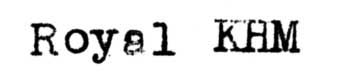
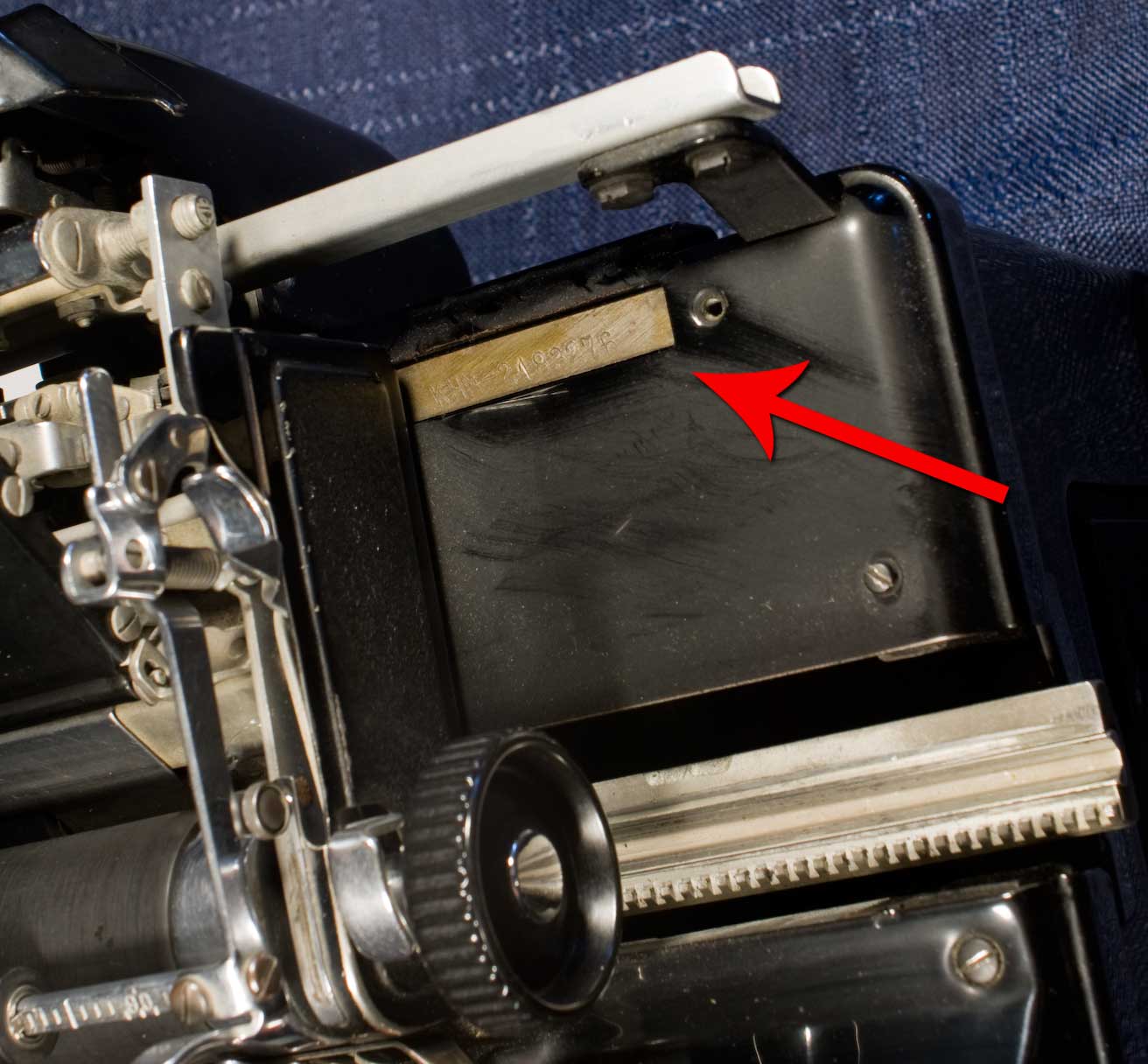 The serial number is located on the carriage bed on the right hand side. It's stamped into a metal plate. The easiest way to expose it is to push the carriage release and let it slide automatically to the far left. The prefix to the serial number is the model, in this case KHM. The serial number lets you figure out the approximate date of manufacture, which is how I know this one was from 1938.
to be continued.